Taking a dormant esports name and engineering a visual system ready for the next level.
GLL was an esports tournament brand operating within competitive online gaming, hosting scrims, community cups and large-scale events across multiple regions. Following the bankruptcy of its parent company, the brand became inactive. At Madly, we were tasked with rebuilding the visual foundation for a potential relaunch — creating a modern, scalable identity prepared for contemporary competitive platforms.
GLL operated in the high-intensity environment of competitive gaming, where clarity, structure and authority are essential. The challenge was to respect the legacy of an existing esports name while redefining its visual expression for a new era.
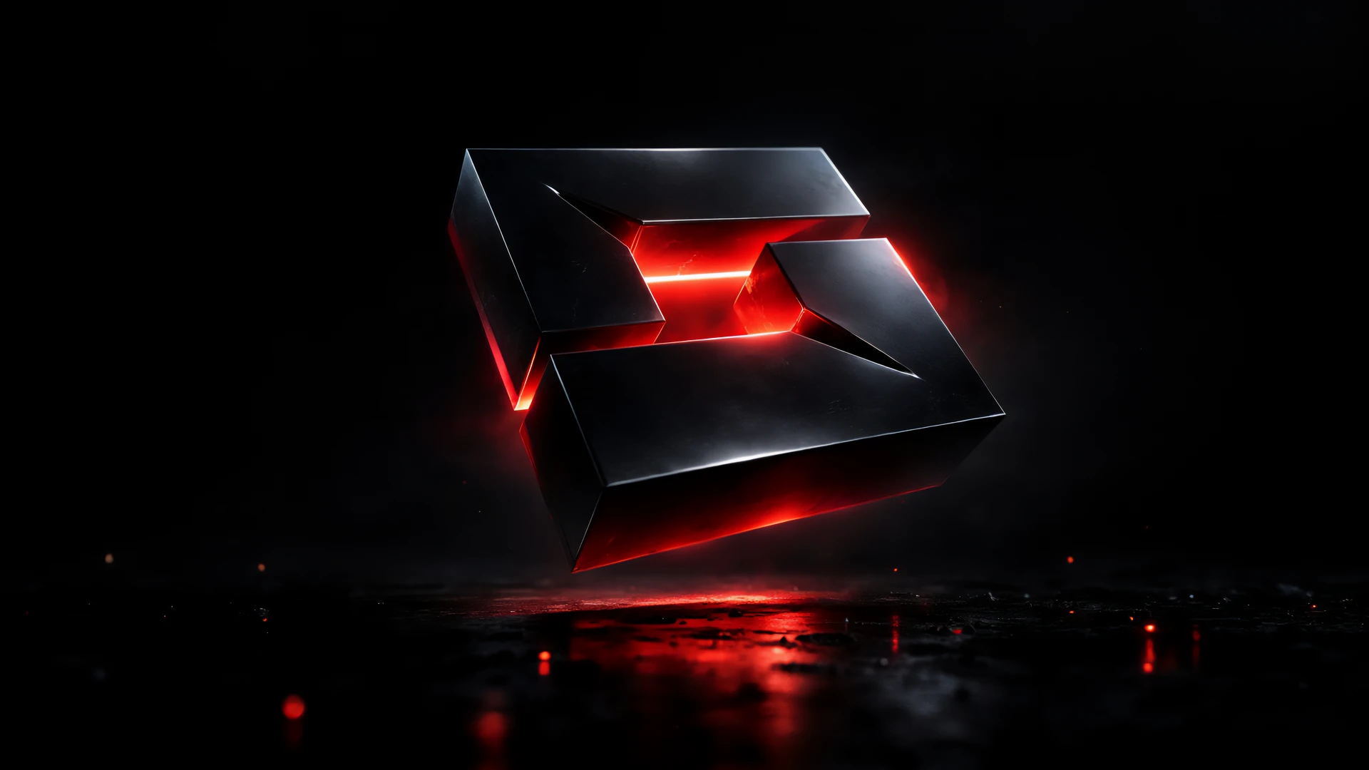
Rather than following the typical mascot-driven esports approach, the identity was rebuilt around a geometric monogram. Two L's form a G, constructed on a rigid square grid and intersected by a controlled diagonal fracture. The mark balances structure and tension — mirroring the dynamic between organized tournaments and explosive competitive moments.
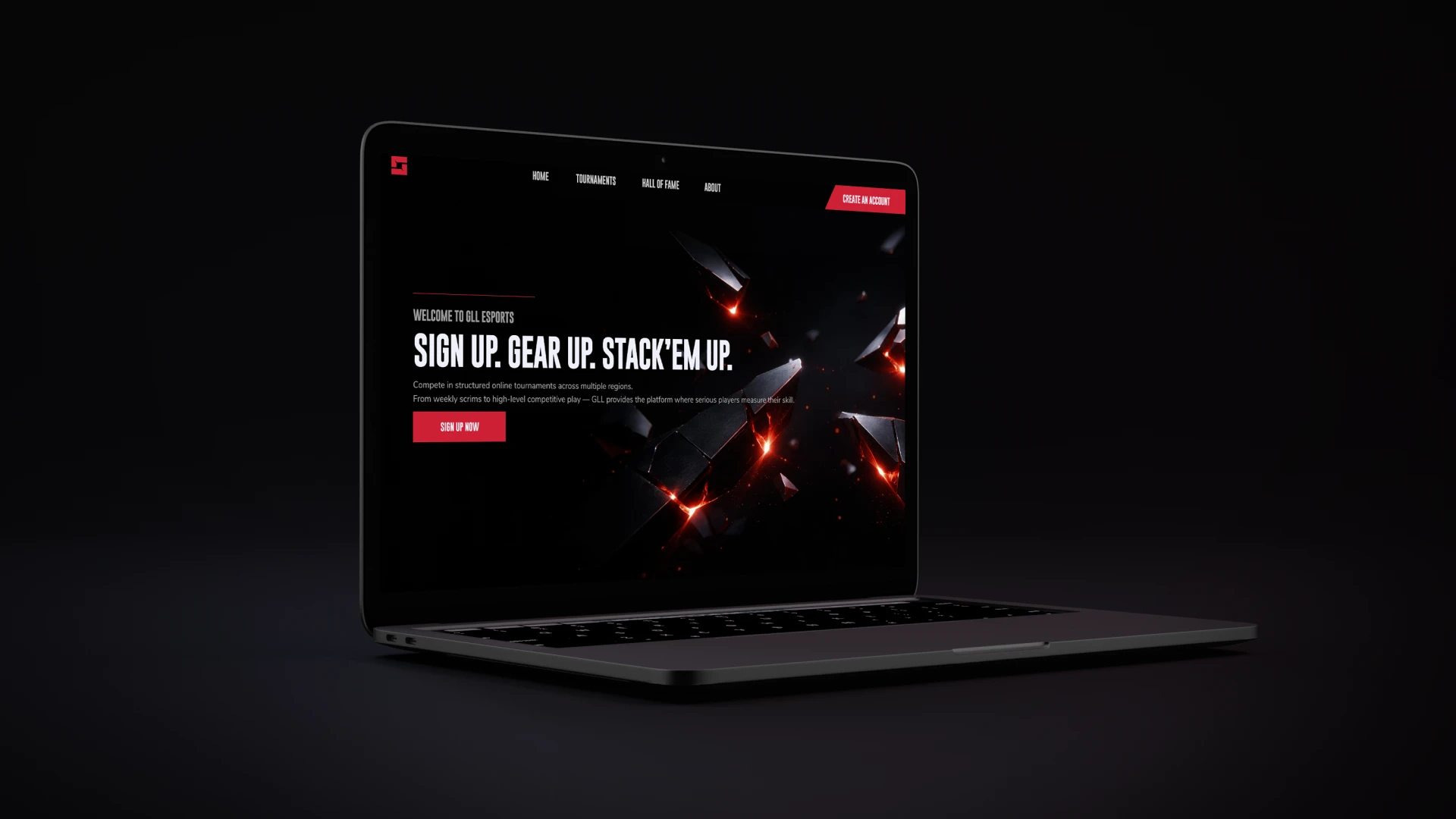
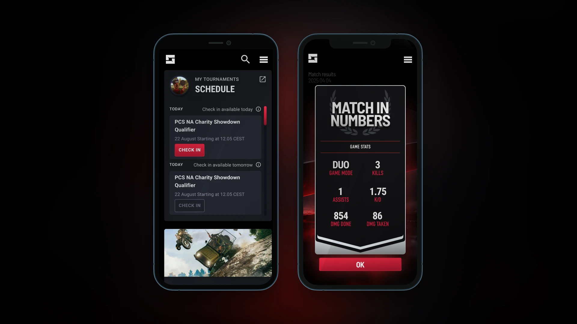
The objective was not merely to design a logo, but to establish a scalable visual system capable of supporting digital platforms, tournament broadcasts and merchandise.
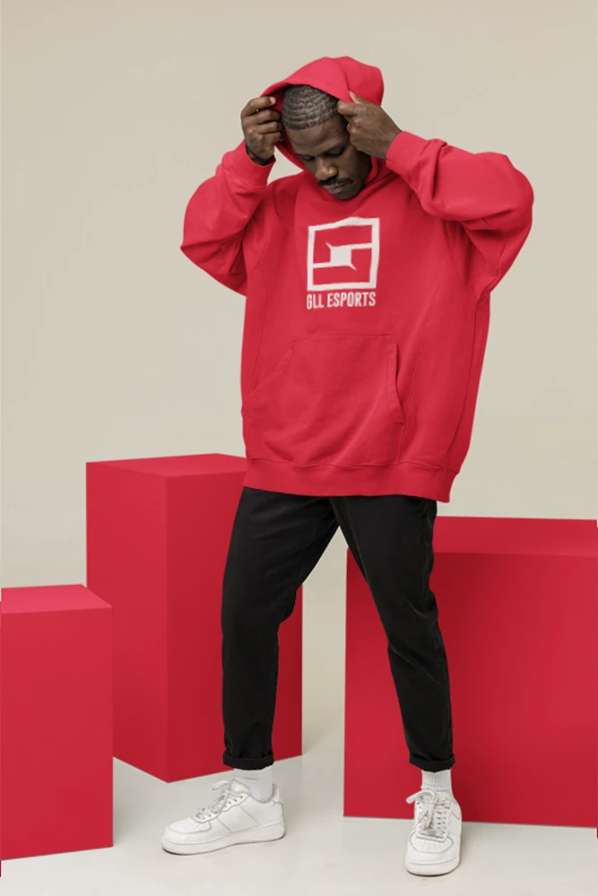
The core mark became the foundation of a modular identity system. A restrained but assertive red was selected to maintain competitive intensity while ensuring strong contrast across dark digital environments.
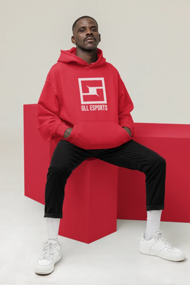
From the geometry of the mark, a repeatable pattern system was developed — enabling cohesive application across apparel, digital assets and environmental surfaces. The visual language is defined by bold geometry, controlled contrast and clear typographic hierarchy.
This project represents a strategic brand reconstruction — translating a dormant esports identity into a contemporary visual framework designed for scalability and longevity.