A bold, dark identity for the platform that turns competitive gaming into tangible rewards.
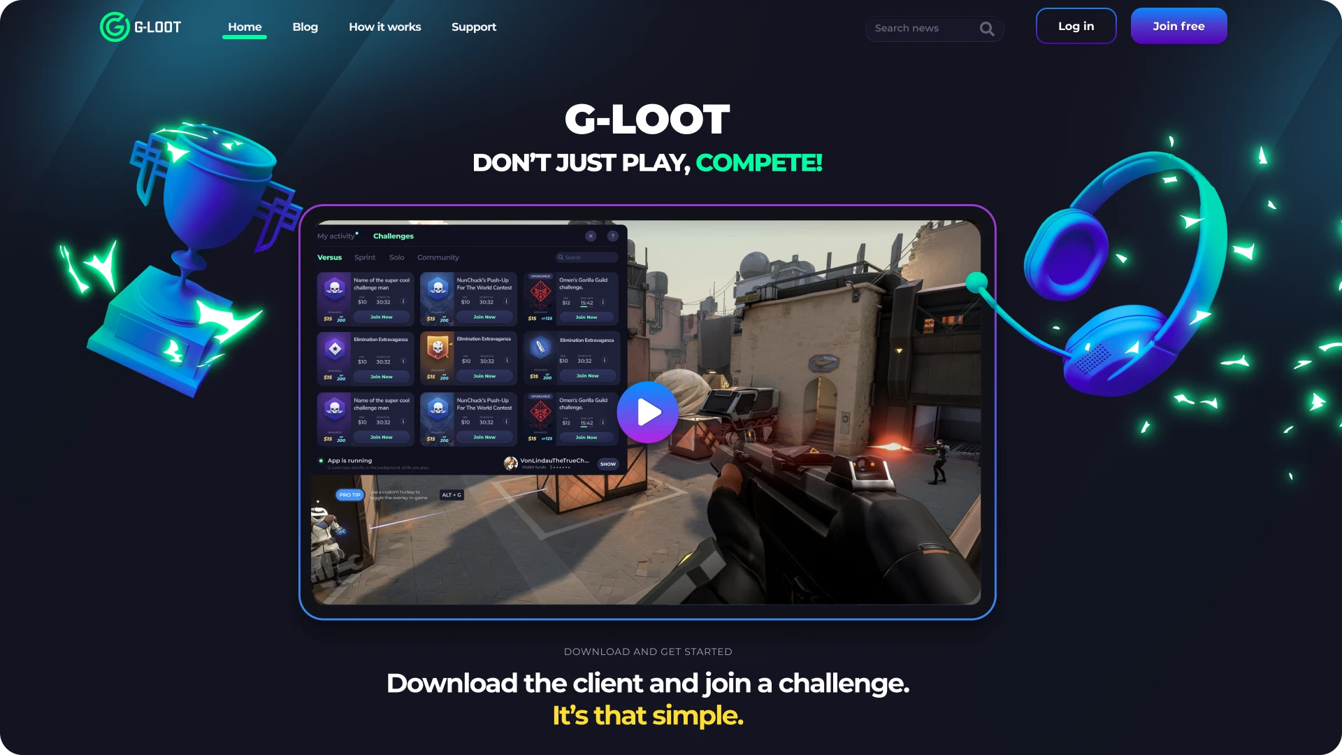
G-Loot was a Swedish esports platform founded by gaming enthusiasts aiming to democratize the competitive esports scene. G-Loot quickly became one of the world's fastest-growing esports platforms, where gamers could compete against each other for real money. We developed a visual identity that placed gaming graphics and a sleek design system at the forefront, allowing graphics and animation to shine and creating an environment where players felt right at home.

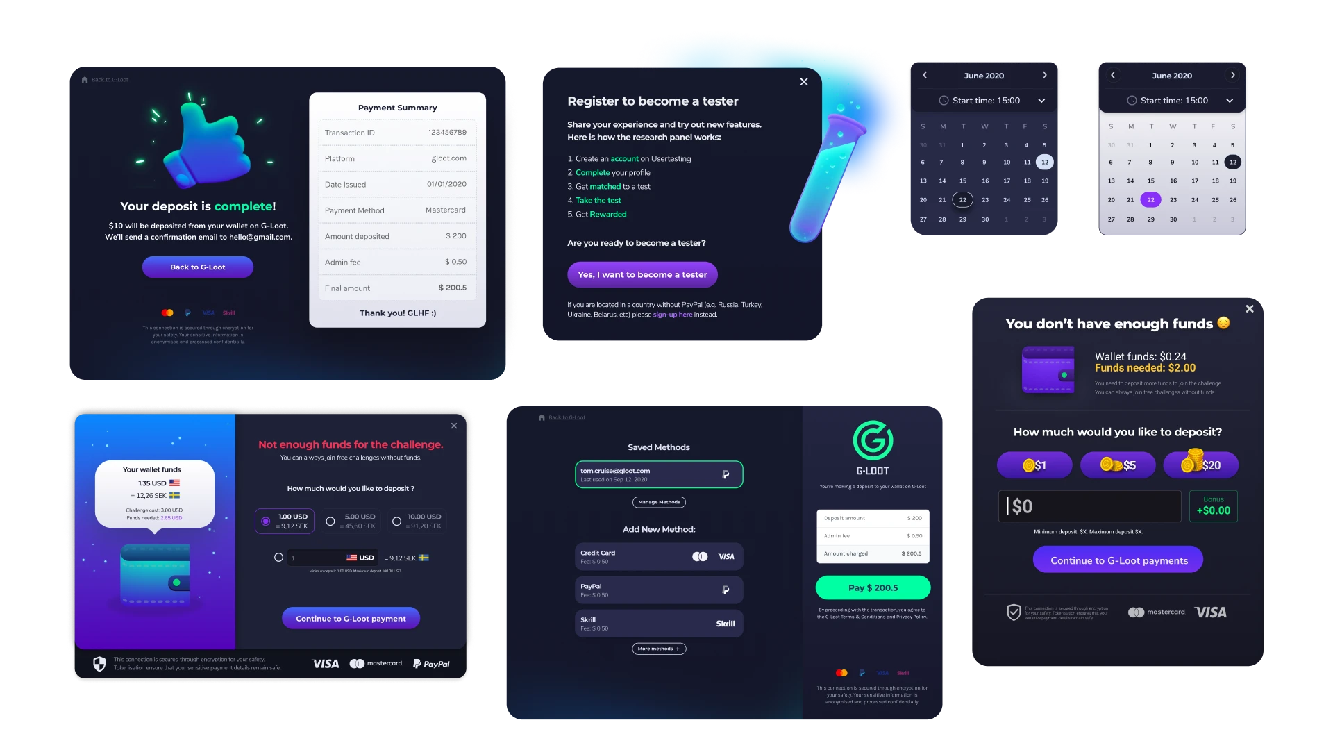
How do you create a platform that is visually appealing, user-friendly, and seamlessly integrates with the game graphics provided by various titles? It wasn't an easy task, but we cracked it with finesse. We crafted a polished design that harmonized with all game graphics, ensuring players felt right at home. We developed a design language that not only complemented the visuals but also boldly stood out.
G-Loot received a look that felt relevant to its users, and with a user interface that felt like it was straight out of a familiar game, the overall experience was solidified.
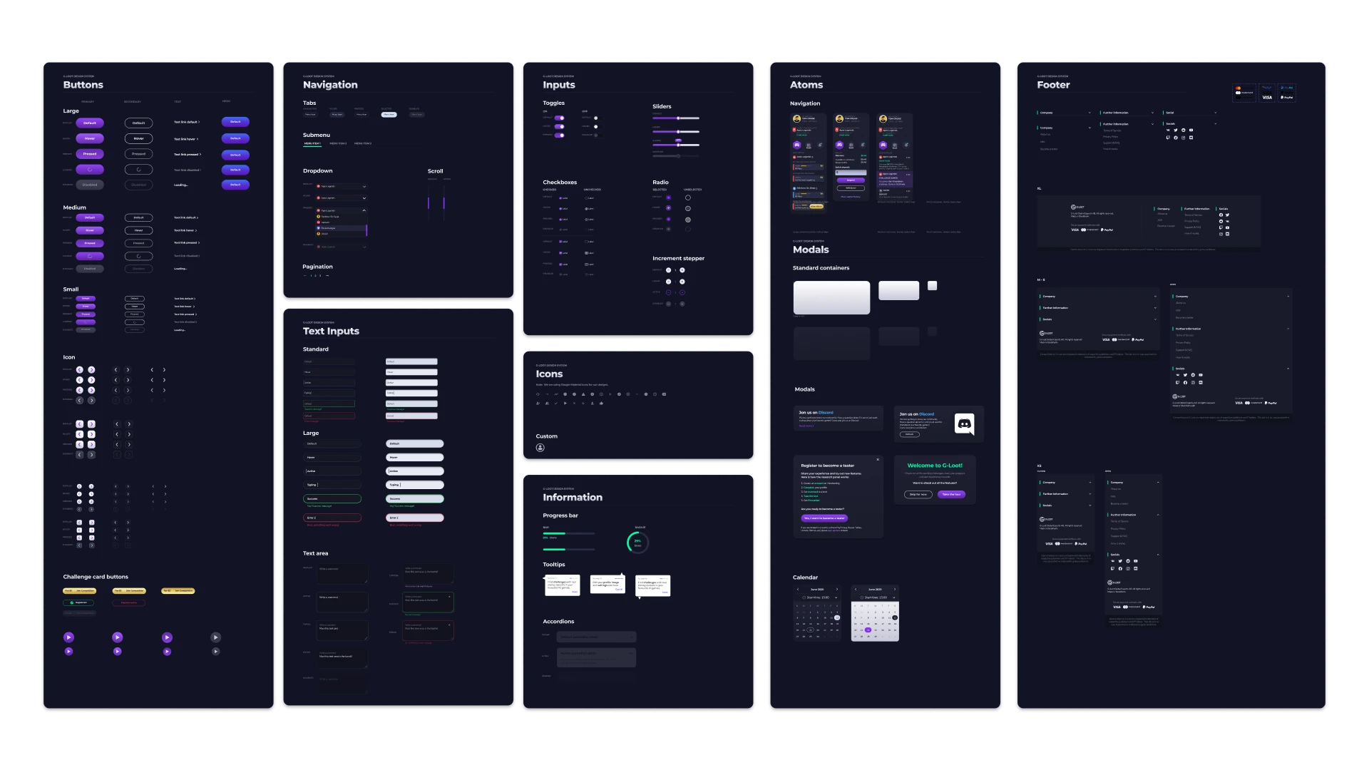
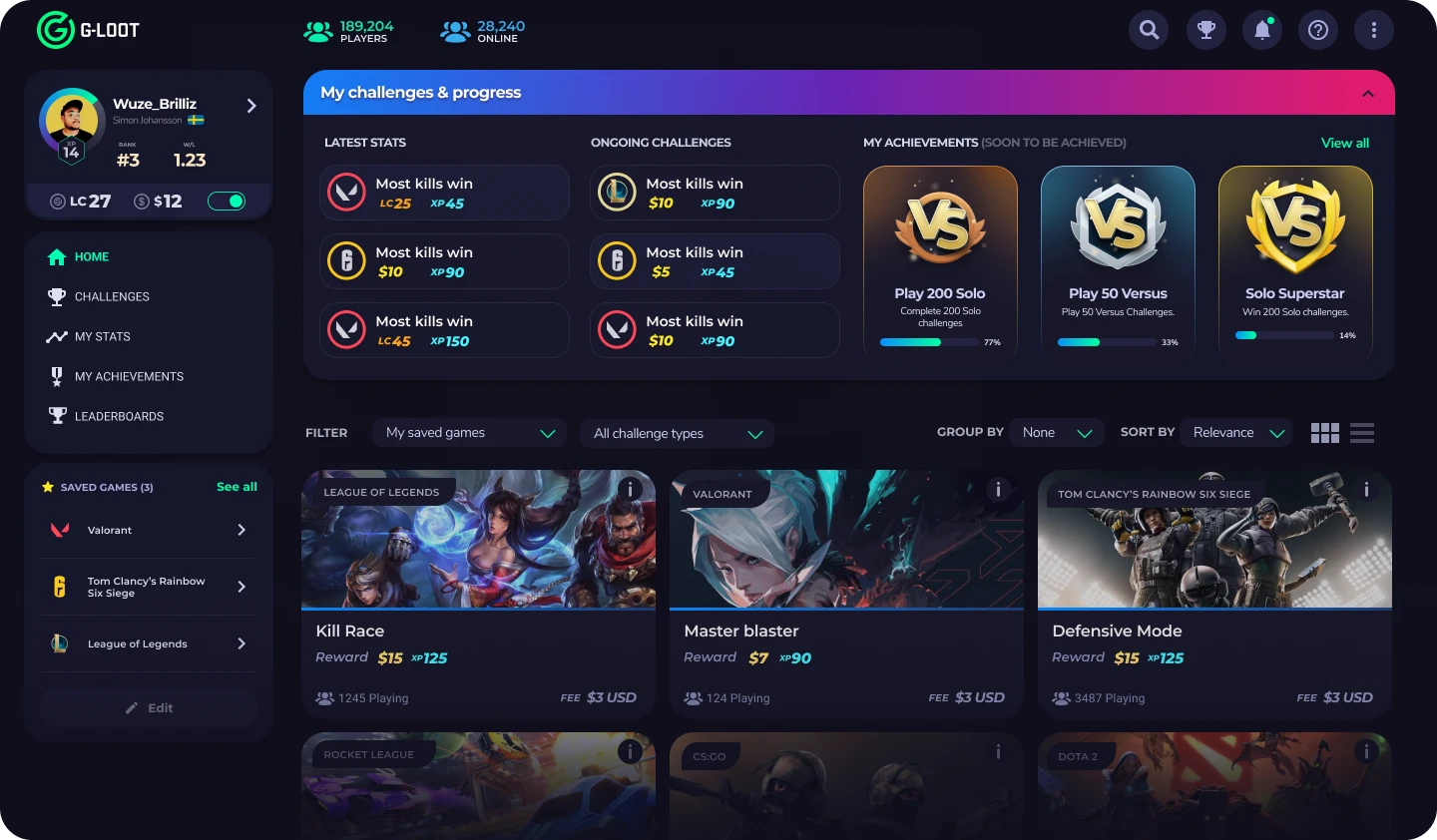
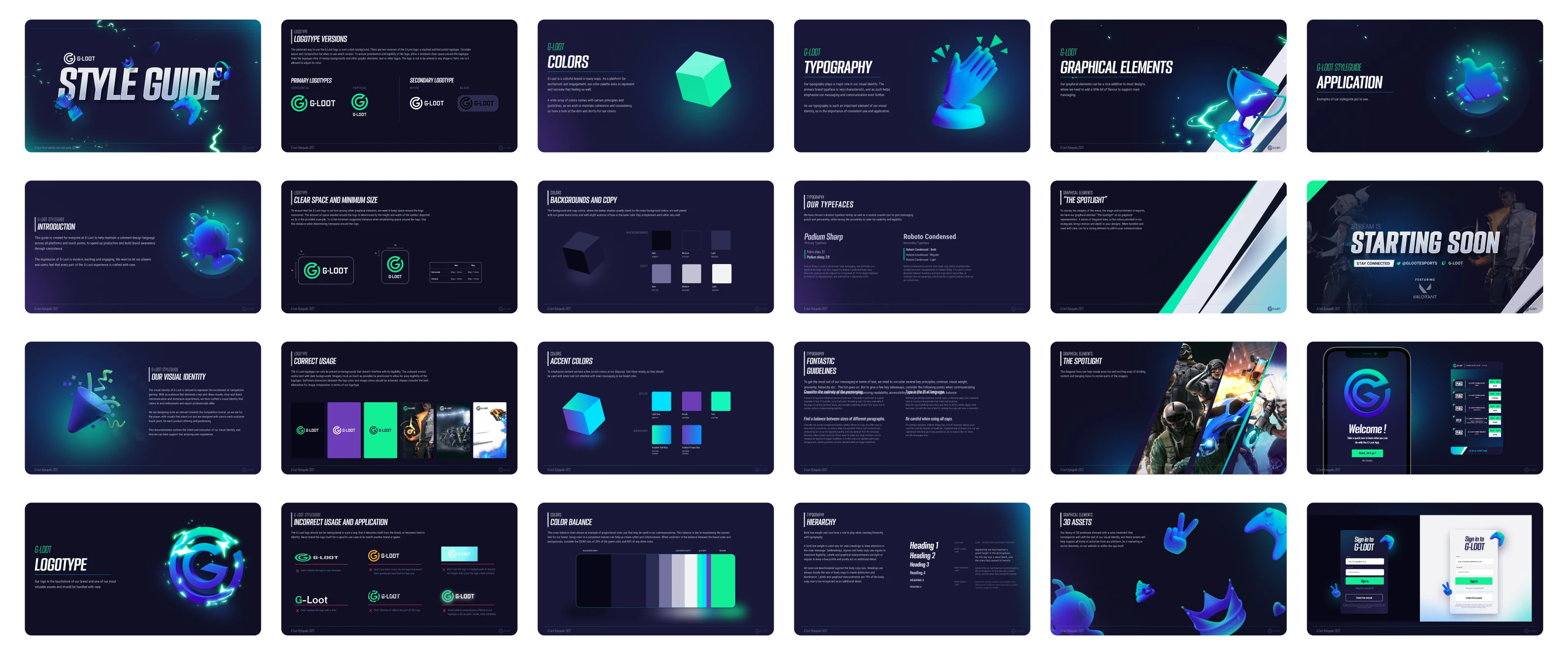
Every color choice was carefully considered, and the shapes were equally deliberate. The palette and design language remained consistent throughout the entire user journey, ensuring that the focus stayed on the content. In a UI that feels playful yet credible, it's crucial to strike the right balance so that the information takes center stage, with all surrounding graphics supporting the message.